The global mental health app market is expected to hit $7.18 billion in 2024, up from $6.22 billion in 2023. Unfortunately, research suggests that users of mental health apps often encounter usability problems, including a lack of personalized support, intervention, or resources, an inconsistent user experience, and complex or confusing interfaces. In short, poor design can render even the most potentially beneficial apps ineffective and drive customers away.
That means there is a significant opportunity for newcomers in the mental health app space to improve upon existing UI design and make it easier for users to benefit. For example, in 2022, a San Francisco-based startup developing a mental health app for families brought me in to create an engaging, intuitive, and family-friendly prototype to present to investors.
The project was a success: The company received $22 million in funding and officially launched in 2022. But the road to getting there included many design challenges. Here, I discuss the problems my team faced in the early design process—including a tedious onboarding experience, a confusing navigation flow, and an uninviting app interface—and how we overcame them.
Putting Users Front and Center in the Design Process
When I joined the project, the company’s research team had already homed in on the intended app audience by conducting user research, identifying common user segments, and creating user personas. The three personas were children facing mental health challenges such as anxiety, depression, ADHD, and behavioral problems; family members and primary caregivers seeking to support these children; and healthcare professionals providing care to the children and their families.
My design team began by mapping out user flows and determining what features would meet the needs of the user personas. Using Figma, we created low-fidelity wireframes of the app’s screens to piece together where users would start their journey, how they would navigate to other pages, and the key actions they would need to take to complete a task. We established that there would be four key areas within the app:
- An overview of the app’s features where families would find helpful information such as appointment reminders and suggested resources
- A communication portal where children could connect with healthcare specialists via video and chat sessions
- A resource hub for families and caregivers that included articles, white papers, downloads, and toolkits
- An area for reports and related documents that families and caregivers could view to track their children’s progress
Next, we conducted usability testing on our initial wireframes with internal stakeholders to analyze our assumptions about the user flow. Above all, we wanted to determine how many steps were required to achieve specific goals, such as completing the onboarding process and reaching a relevant article in the resource hub. This activity helped us discover where to simplify overly complex workflows and create more intuitive navigation flows.
Taking the First Step: Onboarding
Therapy app onboarding should offer a comfortable entry point for visitors who may already be in distressing situations when they first encounter the app. Unfortunately, the nature of this app meant we had to gather fairly extensive information during onboarding in order to offer relevant treatment plans—and our initial onboarding flow comprised several long forms and a long list of questions that families would need to answer before reaching the app’s core features.
Since shortening the onboarding flow wasn’t possible, we aimed to make it more interactive and manageable instead.

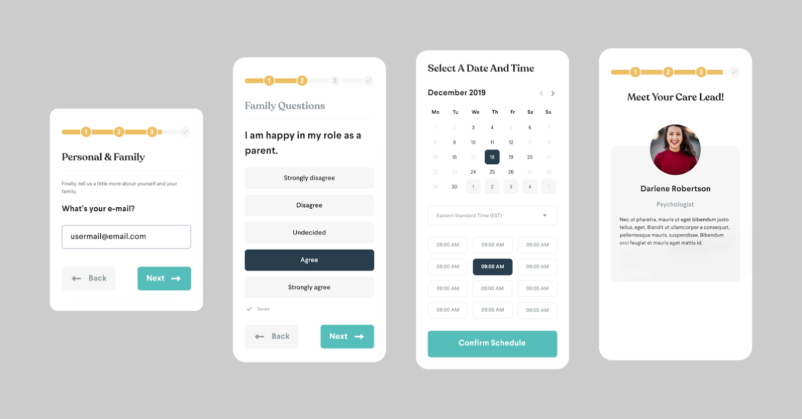
In the first place, we separated the onboarding system bit by bit to provide clients with a reasonable feeling of where they and was straightaway. We added determinate advancement pointers to assist clients with imagining the quantity of steps until culmination. A “Back” embolden button permitted clients to explore back to a past move toward redress incorrect data, and a “Next” button empowered them to push ahead through rectified advances. We additionally added an autosave highlight so clients wouldn’t lose their advancement if there should be an occurrence of unforeseen disturbances, for example, unintentional application conclusion.
One more general improvement was the expansion of clear visual prompts to the onboarding stream. Concentrates on demonstrate the way that processing data can feel overpowering when it is hard to picture. Strong visual orientation (such as icons, arrows, progress bars, tooltips, animations, and other things) helps users know what they need to do, what to do next, or important information they need to pay attention to.
We likewise worked on the introduction of the various decision inquiries by making an unmistakable visual order that recognized each inquiry from its potential responses through contrasts in text style weight, size, and variety. Every conceivable reaction was put on a different line in a plainly noticeable, interactive box. Moreover, the picked answer was featured with a hazier variety to support client input, limit blunders, and obviously show that these were single-select inquiries.
Making Assets Simple to Track down With Natural Route
The application offered an amazing measure of accommodating data in the client asset center point, yet we tracked down that the underlying plan of that piece of the application had no reasonable progressive system or coherent classification, causing it to seem jumbled and overpowering. A parent looking for content on fear of abandonment would need to look at the whole asset center to view as pertinent substance, as opposed to just exploring to a reasonable classification.
To get things started, we made a welcome screen with three main sections: understanding classifications (Stresses and Uneasiness; Rest and Sleep time; Outrage and Hostility, and so forth.); personalized recommendations within the app based on previous reading habits; and resources saved. We implemented a horizontal scrolling feature in the reading categories area, which is frequently utilized in content segmentation. This feature would enable users to quickly scan various subjects without having to scroll too much vertically. Clients could likewise choose a perusing class to peruse its articles.
A perspective on the application’s better asset center. Reading categories, topic tags, and article previews can be seen in the updated design depicted in the images.
Association is basic while exploring huge volumes of content inside an application. ( Little Otter)
We then planned the article cards. Before committing their time and attention, a large card containing a preview of each article allowed users to quickly assess its relevance and potential for engagement. The cards incorporated the article title, a legend picture, assessed understanding time, pertinent age gathering, and class labels for comparable points. ( We likewise made the labels interactive so clients could undoubtedly leap to different articles of interest.)
What’s more, we attempted to further develop the perusing experience for each article and consolidate highlights to assist with busying guardians and parental figures benefit from the asset center. We added an upward progress bar to assist clients with remaining focused inside the text. Additionally, we included a text highlighter that saved portions, topics, and insights for future reference. We likewise added a “Save for some other time” button so clients could get back to articles.
The final challenge we faced was how to use visual design to create a welcoming and supportive environment for users. The organization previously had a style guide set up that characterized variety ranges, typography, and iconography. We currently expected to blend these plan components such that felt welcoming and good for clients exploring possibly delicate or setting off subjects.
The brand’s essential variety range was enlivened by the cool greens, pale blues, and muffled pinks and purples of the seaside Pacific Northwest — colors that are frequently considered to make a relieving difference. For the most part, we used those colors, but we also used orange and yellow for resource category tags to add some warmth and optimism.
To make a perfect, adjusted, and coordinated design, we added more than adequate whitespace between UI parts, for example, pictures, structure fields, and fastens. Additionally, we expanded the cushioning around the text in the source of inspiration buttons to ensure the buttons were observable and huge enough to handily tap in a hurry. We likewise expanded the line level of the asset center point article text to make the substance more edible.
Finally, we included peaceful animal imagery, particularly a friendly otter that is prominently displayed throughout the app. This was inspired by research that suggests nature imagery may help improve mood.


